Brand design for Redluco Aviation
Flying privately, taken care of. Redluco Aviation provide the ultimate private jet charter service, globally. From booking the jet to landing at the most convenient private airport, all the arrangements are taken care of so you can relax and travel in style, no stress.
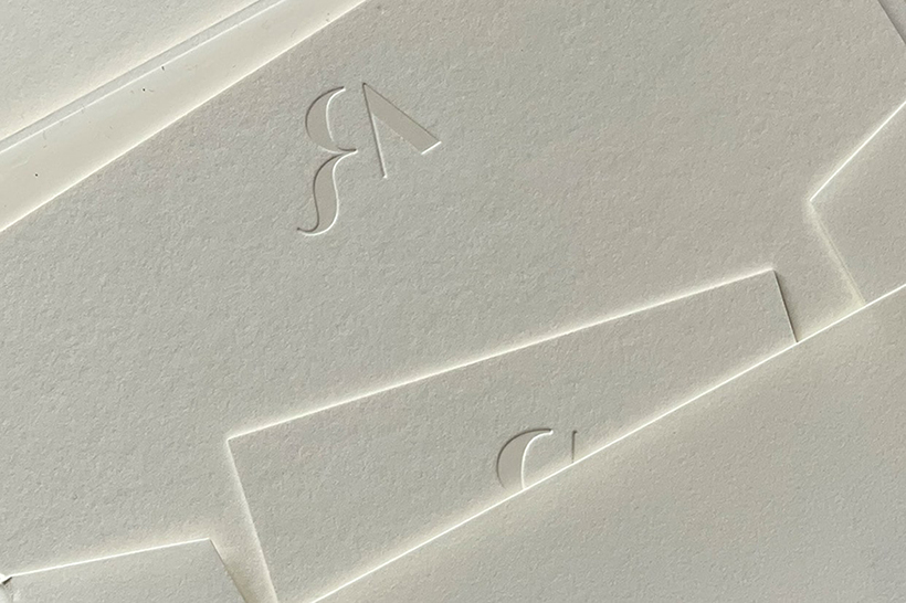
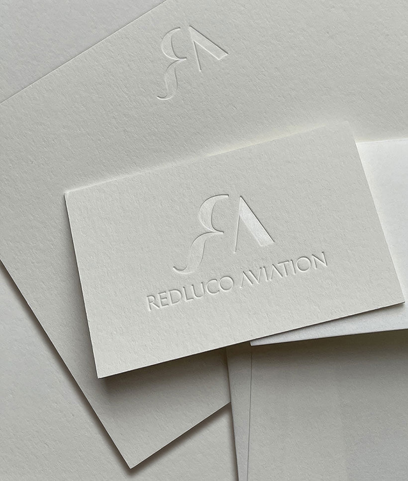
LEAD IMAGE Redluco Aviation stationery samples — business card, compliments card and envelope.
Redluco Aviation required branding for their new company. A monogram, logo, logotype and style guide were developed that included rules for typography, colour palette, hero imagery and supporting brand collateral. Designs were created for the email signature, stationery, sales deck, in-flight menu, social media graphics and website.
GALLERY: 7 IMAGES
Redluco Aviation brand identity